Are we forgetting our past faster?

In a widely discussed paper, Michel and colleagues (2011) analyzed the content of more than five million digitized books in an attempt to identify long-term cultural trends. The data that they used has now been released as the Google NGrams dataset, and so we can use the data to replicate and extend some of their work.
This post is based in one exercise of Matthew J. Salganik’s book Bit by Bit: Social Research in the Digital Age, from chapter 2.
Forgetting Faster
In a widely discussed paper, Michel and colleagues (2011) analyzed the content of more than five million digitized books in an attempt to identify long-term cultural trends. The data that they used has now been released as the Google NGrams dataset, and so we can use the data to replicate and extend some of their work.
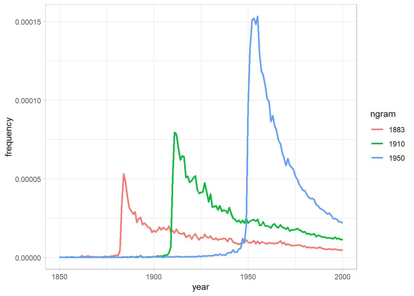
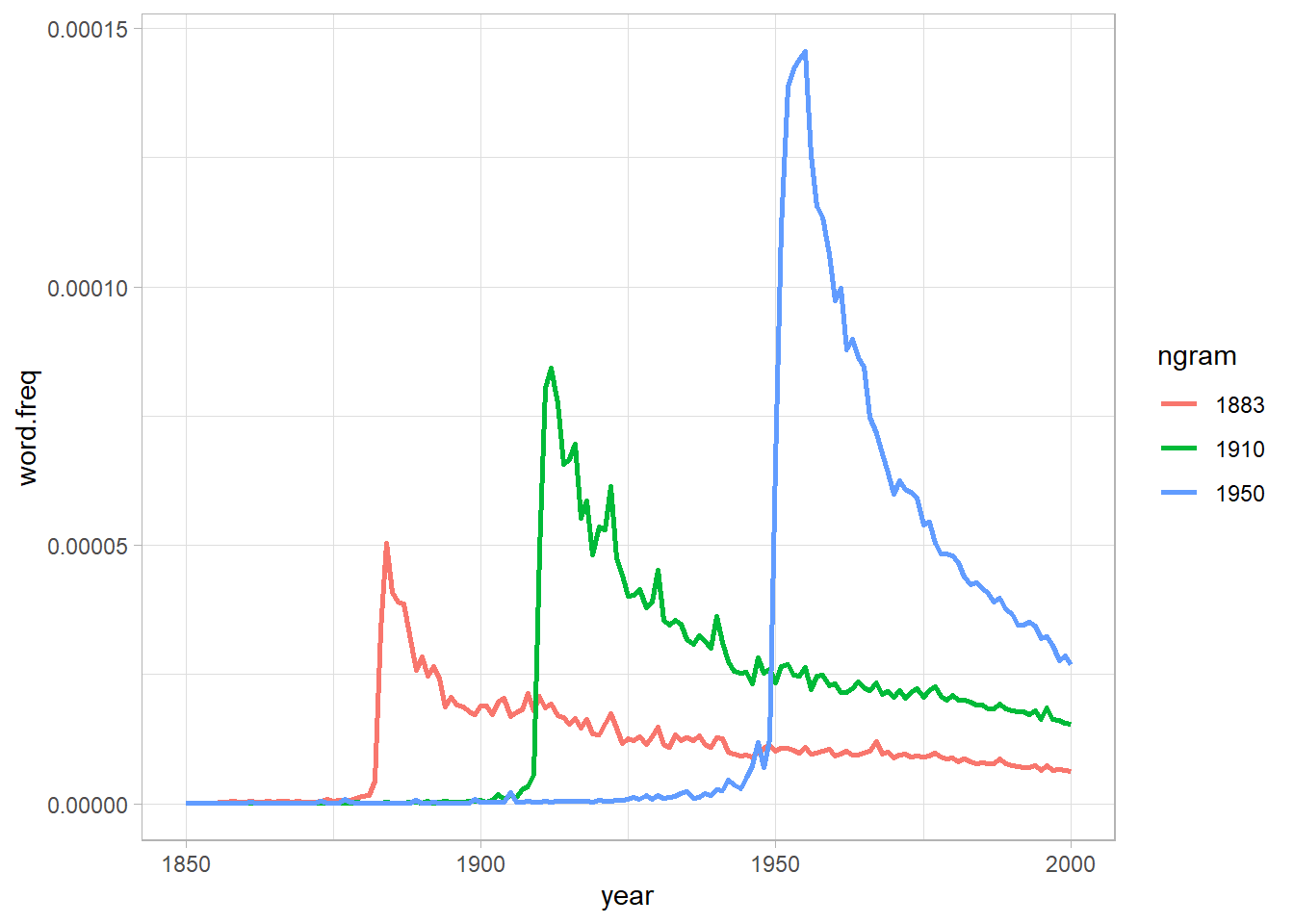
In one of the many results in the paper, Michel and colleagues argued that we are forgetting faster and faster. For a particular year, say “1883,” they calculated the proportion of 1-grams published in each year between 1875 and 1975 that were “1883.” They reasoned that this proportion is a measure of the interest in events that happened in that year. In their figure 3a, they plotted the usage trajectories for three years: 1883, 1910, and 1950. These three years share a common pattern: little use before that year, then a spike, then decay.
Next, to quantify the rate of decay for each year, Michel and colleagues calculated the “half-life” of each year for all years between 1875 and 1975. In their figure 3a (inset), they showed that the half-life of each year is decreasing, and they argued that this means that we are forgetting the past faster and faster. They used version 1 of the English language corpus, but subsequently Google has released a second version of the corpus.

figure 3a
This activity will give you practice writing reusable code, interpreting results, and data wrangling (such as working with awkward files and handling missing data). This activity will also help you get up and running with a rich and interesting dataset.
Part A
Get the raw data from the Google Books NGram Viewer website (http://storage.googleapis.com/books/ngrams/books/datasetsv2.html). In particular, you should use version 2 of the English language corpus, which was released on July 1, 2012. Uncompressed, this file is 1.4 GB.
|
|
| ngram | year | match_count | volume_count |
|---|---|---|---|
| 1'23 | 1799 | 1 | 1 |
| 1'23 | 1804 | 1 | 1 |
| 1'23 | 1805 | 1 | 1 |
| 1'23 | 1818 | 1 | 1 |
| 1'23 | 1822 | 1 | 1 |
| 1'23 | 1824 | 1 | 1 |
Part B
Recreate the main part of figure 3a of Michel et al. (2011). To recreate this figure, you will need two files: the one you downloaded in part (a) and the “total counts” file, which you can use to convert the raw counts into proportions. Note that the total counts file has a structure that may make it a bit hard to read in. Does version 2 of the NGram data produce similar results to those presented in Michel et al. (2011), which are based on version 1 data?
|
|
| year | match_count | page_count | volume_count |
|---|---|---|---|
| 1505 | 32059 | 231 | 1 |
| 1507 | 49586 | 477 | 1 |
| 1515 | 289011 | 2197 | 1 |
| 1520 | 51783 | 223 | 1 |
| 1524 | 287177 | 1275 | 1 |
| 1525 | 3559 | 69 | 1 |
|
|
Part C
Now check your graph against the graph created by the NGram Viewer (https://books.google.com/ngrams).
Part D
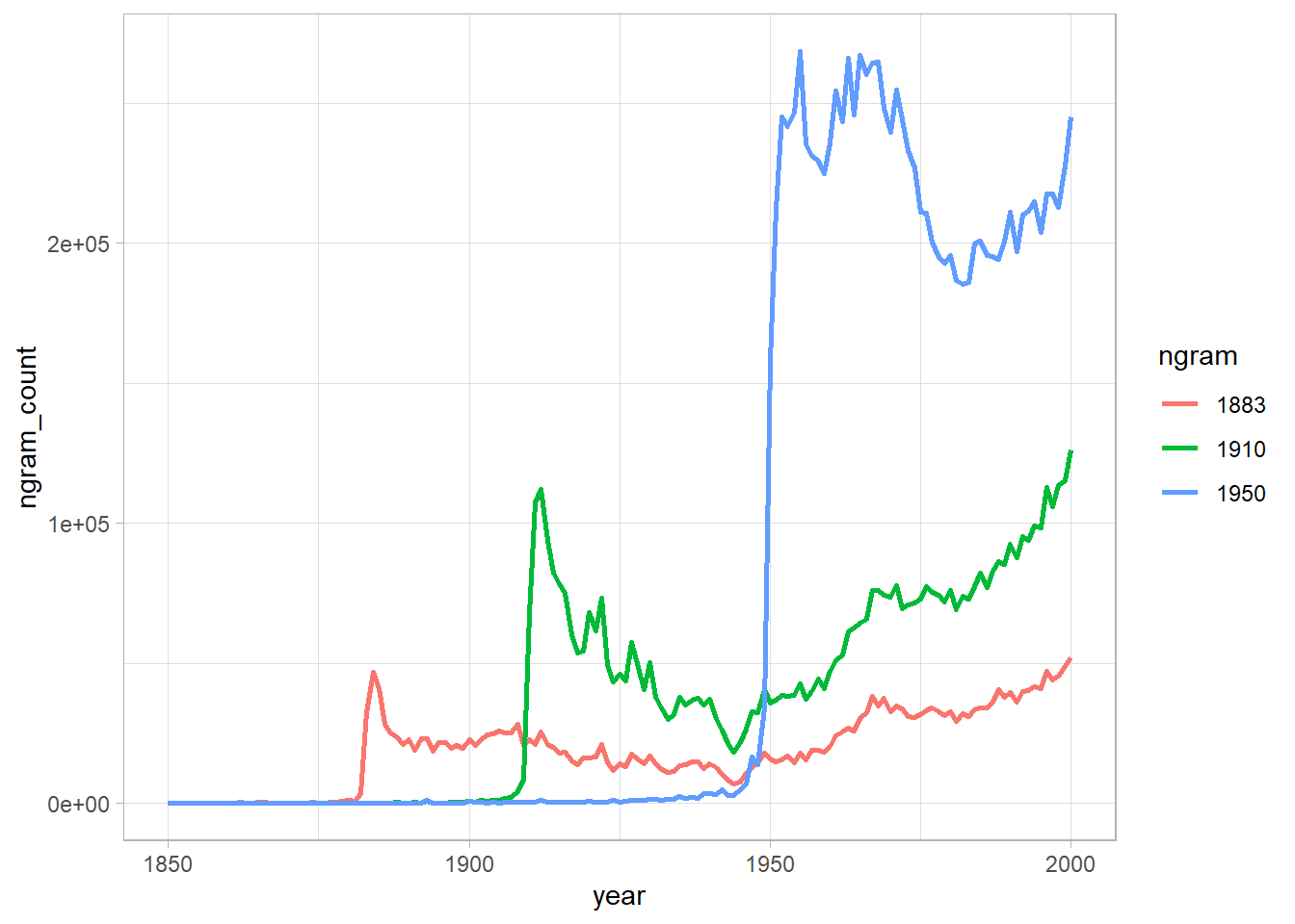
Recreate figure 3a (main figure), but change the y-axis to be the raw mention count (not the rate of mentions).
|
|
Part E
Does the difference between (b) and (d) lead you to reevaluate any of the results of Michel et al. (2011). Why or why not?
Well, are the years really forgotten?
Part F
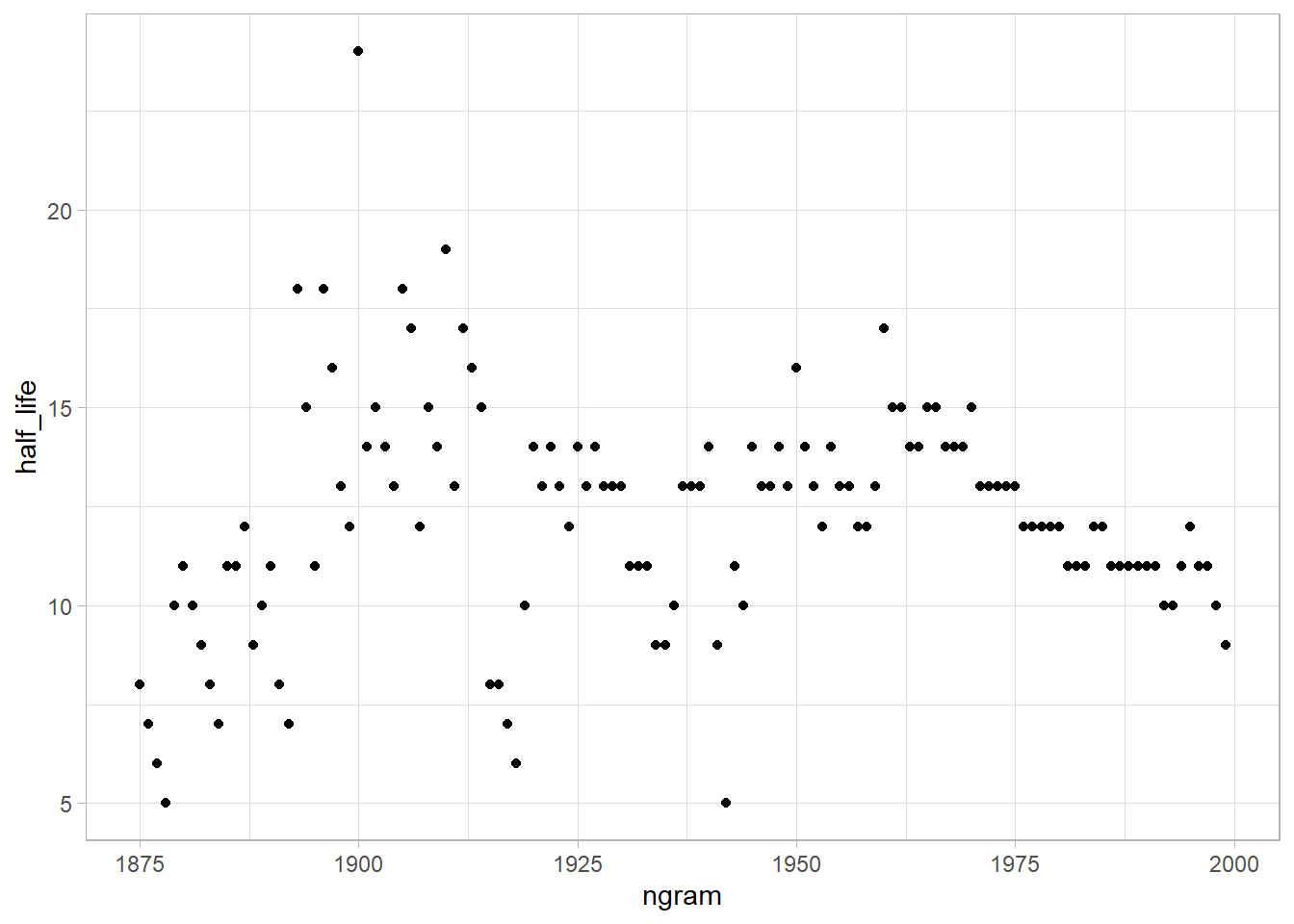
Now, using the proportion of mentions, replicate the inset of figure 3a. That is, for each year between 1875 and 1975, calculate the half-life of that year. The half-life is defined to be the number of years that pass before the proportion of mentions reaches half its peak value. Note that Michel et al. (2011) do something more complicated to estimate the half-life (see section III.6 of their Supporting Online Information) but they claim that both approaches produce similar results. Does version 2 of the NGram data produce similar results to those presented in Michel et al. (2011), which are based on version 1 data? (Hint: Don’t be surprised if it doesn’t.)
|
|
Part G
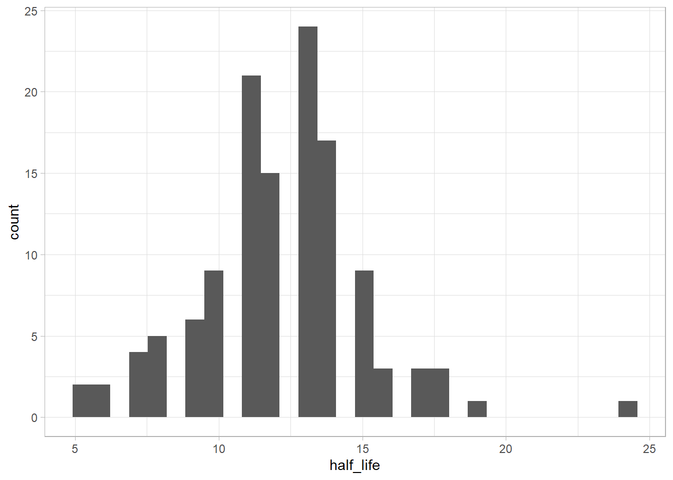
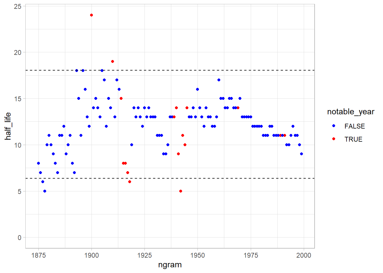
Were there any years that were outliers, such as years that were forgotten particularly quickly or particularly slowly? Briefly speculate about possible reasons for that pattern and explain how you identified the outliers.
|
|
|
|
|
|
|
|
|
|
Let’s use two standard deviations (~95% of the points) around the mean as “regular half life” values.
|
|
|
|
It’s strange that 1918 (last year of WW I, and the year of russian revolution) and 1942 (a year in the WW II) are easily forgotten.
|
|
|
|
The 1900 is a “millennial” year, and 1910 was the year of the aviation (and comet Harley appearance), but I was thinking that the year of WWI and WWII was particularly slowly to forget. Let’s compare:
|
|
Extra
After doing the analyzes proposed by the book, I was intrigued if it was possible to reproduce the results of the original article using the original data (google ngram dataset v1) and how we could do this using R.
Download and Importing the Dataset
First we need to download and load the data, unlike version 2, in the first version of the data the tokens of the years are spread over 10 CSV files, so it is necessary to download and import the data.
|
|
| ngram | year | word.count | page.count | book.count |
|---|---|---|---|---|
| 1867 | 1574 | 1 | 1 | 1 |
| 1867 | 1575 | 12 | 8 | 2 |
| 1867 | 1584 | 3 | 2 | 1 |
| 1867 | 1592 | 2 | 2 | 1 |
| 1867 | 1637 | 5 | 5 | 1 |
| 1867 | 1638 | 2 | 2 | 1 |
As we did in the first analysis, we need the total word counting to calculates the frequency.
|
|
| year | total.words | total.pages | total.books |
|---|---|---|---|
| 1520 | 51191 | 112 | 1 |
| 1527 | 4384 | 18 | 1 |
| 1541 | 5056 | 27 | 1 |
| 1574 | 60089 | 345 | 1 |
| 1575 | 374033 | 1059 | 2 |
| 1576 | 26278 | 81 | 1 |
Prepare the dataset
Let’s prepare the data for analysis calculating the frequency
|
|
| ngram | year | word.count | total.words | word.freq |
|---|---|---|---|---|
| 1867 | 1574 | 1 | 60089 | 1.66e-05 |
| 1867 | 1575 | 12 | 374033 | 3.21e-05 |
| 1867 | 1584 | 3 | 382341 | 7.80e-06 |
| 1867 | 1592 | 2 | 253381 | 7.90e-06 |
| 1867 | 1637 | 5 | 383892 | 1.30e-05 |
| 1867 | 1638 | 2 | 118459 | 1.69e-05 |
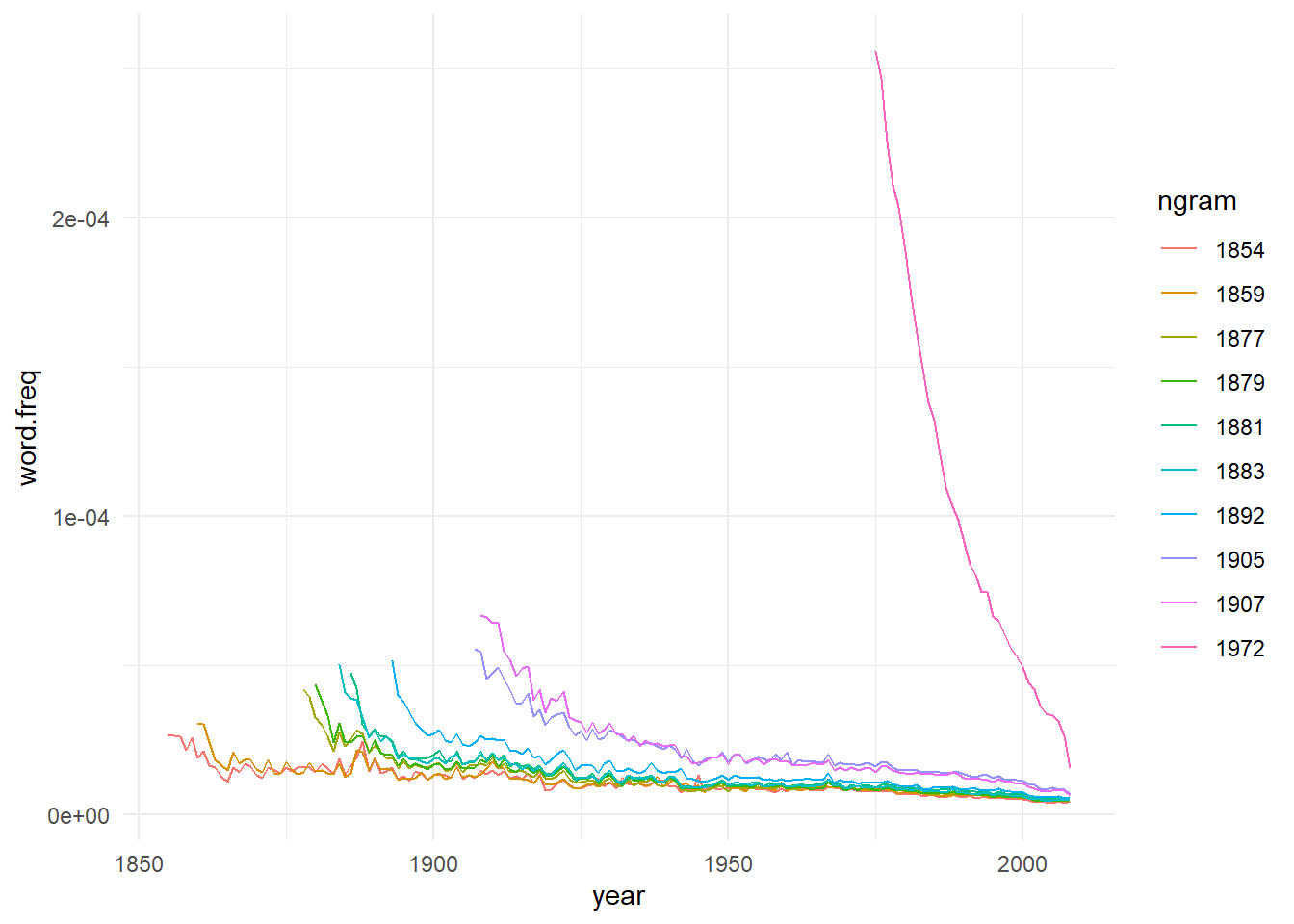
Also, as we did in the first analysis, let’s check if we can reproduce the fig 3A from the original article.
|
|
Exponencial Decay
We will try to redo year half life calculation, but this time we will do this by fitting an exponential decay model for each token year, starting from its peak frequency.
First, let’s slice each year data from its peak.
|
|
| ngram | max.year | max.freq |
|---|---|---|
| 1867 | 1868 | 0.0000456 |
| 1875 | 1876 | 0.0000440 |
| 1892 | 1893 | 0.0000515 |
| 1897 | 1898 | 0.0000477 |
| 1899 | 1900 | 0.0000546 |
| 1953 | 1955 | 0.0001415 |
|
|
| ngram | year | word.count | total.words | word.freq | max.year | max.freq |
|---|---|---|---|---|---|---|
| 1867 | 1868 | 20707 | 454334293 | 4.56e-05 | 1868 | 4.56e-05 |
| 1867 | 1869 | 17231 | 500425460 | 3.44e-05 | 1868 | 4.56e-05 |
| 1867 | 1870 | 11691 | 451706276 | 2.59e-05 | 1868 | 4.56e-05 |
| 1867 | 1871 | 12085 | 488849680 | 2.47e-05 | 1868 | 4.56e-05 |
| 1867 | 1872 | 13639 | 503182681 | 2.71e-05 | 1868 | 4.56e-05 |
| 1867 | 1873 | 10112 | 520267515 | 1.94e-05 | 1868 | 4.56e-05 |
|
|
Now, for each year we have the frequency decay from its peak, and yes, the data seems a exponential decay. So, let’s calculates each year ‘half-life’. To do so, we’ll fit and exponential equation of this format:
$$ y(t) = y_{f} + (y_{f}-y_{0}) e^{- \alpha t} $$
We are interest in the $ \alpha $ coefficient, the decay rate, from it we can get the year half-life:
$$ y(t) = Ce^{-\alpha t} $$
Calculating half-life:
$$ \frac{1}{2}C = Ce^{-\alpha t}$$ $$ \frac{1}{2} = e^{-\alpha t} $$
$$ ln(\frac{1}{2}) = -\alpha t $$
$$ t_{half-life} = -\frac{ln(\frac{1}{2})}{\alpha} $$
We’ll use the function SSasymp to make the exponencial equation to use in nls function, this keep us to have to define initial values for $ \alpha $, $ y_{0} $ and $ y_{t} $.
|
|
Finally, lets see how the years half-life progress along the time
|
|
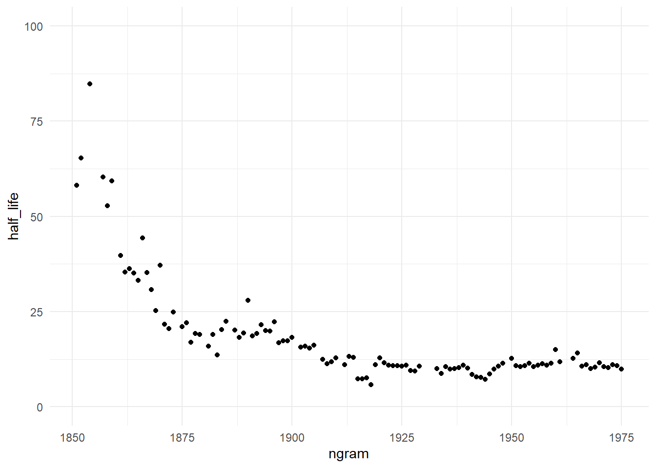
Well, the graph does not seem to be similar to the one found in the original article. Looking the plot, we can see that are a faster forgetfulness in the first year, the frequency of an year are mentioned decay at faster rate along the time, but this occurs only in the beginning.
After 1925 the years keep a constant half-life (and so, a constant decay rate), so by this data we are not forgetting faster.