This post talks about the use of Mean Squared Error (MSE) against the flexibility of a function fitted as a technique to assess the model accuracy in a specific problem as describe in the An Introduction to Statistical Learning in R book.
Measure the quality of fit (regression)
In order to evaluate the performance of a statistical learning method on a given data set, we need some way to measure how well its predictions actually match the observed data. That is, we need to quantify the extent to which the predicted response value for a given observation is close to the true response value for that observation.
In the regression setting, the most commonly-used measure is the mean squared error (MSE), given by:
$$ MSE = \frac{1}{N}\sum_{i=1}^{n}(y_i-\hat{f}(x_i))^2 $$
Where $ \hat{f}(x_i) $ is the predicted (or fitted) function at $ x_i $ and $ y_i $ is the real value.
So, the MSE is computed using the training data that was used to fit the model, and so should more accurately be referred to as the training MSE, but we want to evaluate the performance of the $ \hat{f}() $ against the unknown data points, so we also compute MSE in an test set with data points different from used to fit the $ \hat{f}() $, now we have a $ MSE_{tr} $ for training points and a $ MSE_{ts} $ for test set.
We want to choose the method that gives the lowest test MSE, as opposed to the lowest training MSE ($ MSE_{ts} $).
Comparing $ MSE_{tr} $ and $ MSE_{ts} $
Let’s simulate some situations to see how $ MSE_{tr} $ and $ MSE_{ts} $ against different fitting techniques, we’ll use polynomials fit to simplify the scenarios.
Curve 1
1
2
3
4
5
6
|
# setup
library(ggplot2)
library(tidyverse)
library(reshape2)

set.seed(42)
|
 1
 2
 3
 4
 5
 6
 7
 8
 9
10
11
12
13
14
15
16
17
18
19
20
21
22
23
24
25
26
27
|
# full domain of points (continuous from 0 to 100)
DOMAIN <- 0:100
# function linear gausian noise sd=1
f <- function(x) 0.0005*x^2 + 0.05*x + 0.5
noise <- function(x) 0.5 * rnorm(x)
# build the datasete
tibble(
x = DOMAIN,
f = f(x) # the 'real value'
) %>%
# adding noise
mutate(
y = f + noise(DOMAIN) # adding some noise
) -> dt
# separing in training and testing
idx.tr <- sample(DOMAIN,round(length(DOMAIN)/2))
dt_tr <- dt[idx.tr,]
dt_ts <- dt[-idx.tr,]
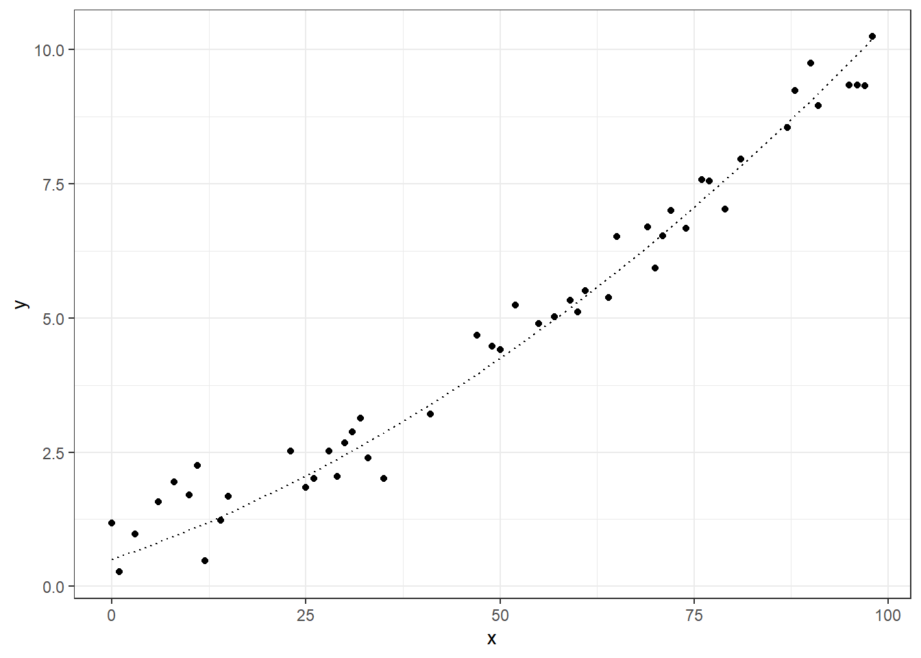
# visualizing training data
ggplot(dt_tr, aes(x=x)) +
geom_point(aes(y=y)) +
geom_line(aes(y=f), linetype="dotted") +
theme_bw()
|
Let’s fit some cases in these data sets, we will use an linear regression, and some polynomial data.
 1
 2
 3
 4
 5
 6
 7
 8
 9
10
11
12
13
14
15
16
17
|
# lets fit linear model and polynomials with degree 2, 3, e 10
degrees <- c(1,2,3,5,10)

# a function to fit a poly
fitPoly <- function(degree,data){
  lm(y ~ poly(x, degree, raw=TRUE), data)
}

# apply the functions on the selected degrees
models <- map(degrees, fitPoly, data=dt_tr)

# lets get de predicted values for these models
models %>%
  map(function(model){model$fitted.values}) %>%
  set_names(paste0("f",degrees)) %>%
  as_data_frame() %>%
  cbind(dt_tr, .) -> dt_tr_fit
|
1
2
3
|
## Warning: `as_data_frame()` was deprecated in tibble 2.0.0.
## Please use `as_tibble()` instead.
## The signature and semantics have changed, see `?as_tibble`.
|
1
2
3
4
5
6
7
8
9
|
# converting from wide to long format to plot all together
dt_tr_long <- dt_tr_fit %>%
  melt(id.vars="x", variable.name="model", value.name = "fitted")

# ploting the fitted curves
ggplot(dt_tr_long) +
  geom_line(data=dt_tr_long[dt_tr_long$model!="y",], aes(x=x, y=fitted, colour=model)) +
  geom_point(data=dt_tr_long[dt_tr_long$model=="y",], aes(x=x,y=fitted)) +
  theme_bw()
|
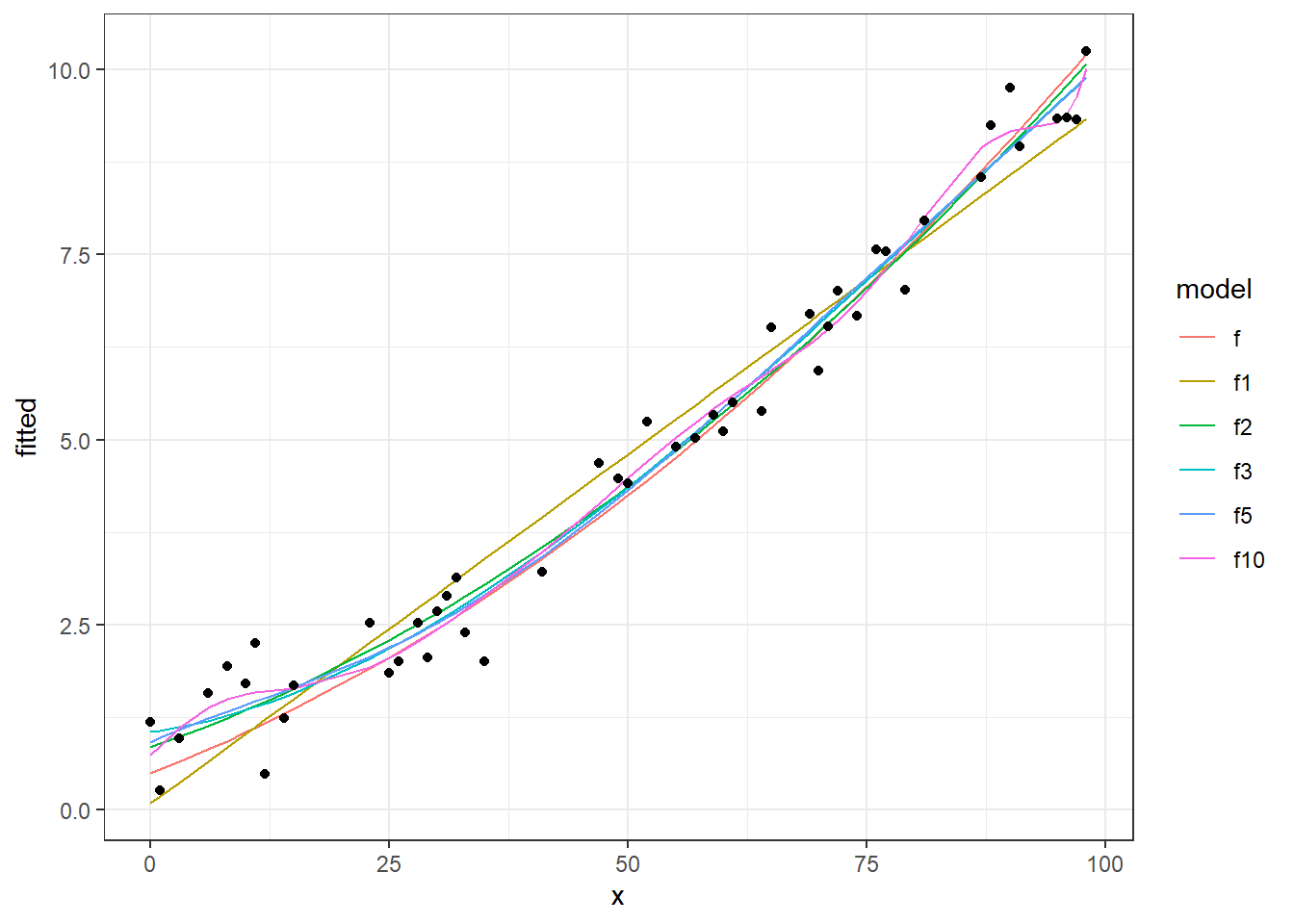
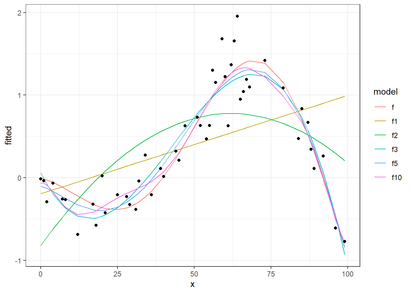
We see in this chart, the real data points (points), the real function (continuous black line) and different fitting curves (colored lines) from 1 degree to 50 degree. Now let’s see the performances of these models, calculating and plotting MSE on training and testing sets.
 1
 2
 3
 4
 5
 6
 7
 8
 9
10
11
12
13
14
15
16
17
18
19
20
21
22
23
24
25
26
27
|
# calc MSE from the residuals of the model
getMSE <- function(lm.model) sum(lm.model$residuals^2)/length(lm.model$residuals)

# calc MSE to the training set in a model
calcMSE <- function(lm.model, newdata){
  y_hat <- predict(lm.model, newdata=newdata)
  mse <- (1/length(y_hat))*sum( (newdata$y-y_hat)^2 )
  return(mse)
}

# performances
perf <- tibble(
  degree = degrees,
  MSE.tr = unlist(map(models, getMSE)),
  MSE.ts = unlist(map(models, calcMSE, dt_ts))
)

# "the real MSE" inputed by noise
MSE <- sum( (dt$y-dt$f)^2 ) / nrow(dt)

# plot the performances
ggplot(perf,aes(x=degree)) +
  geom_line(aes(y=MSE.tr), colour="red") +
  geom_line(aes(y=MSE.ts), colour="blue") +
  geom_hline(yintercept = MSE, linetype="dashed") +
  ylab("MSE") +
  theme_bw()
|
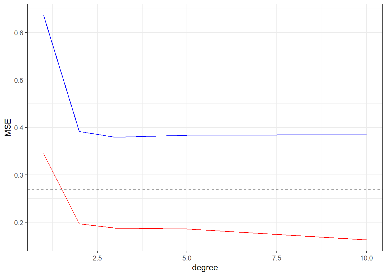
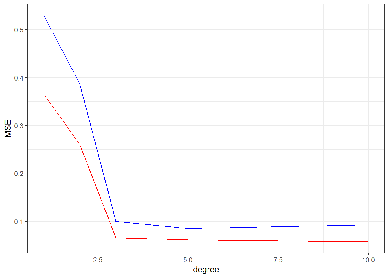
We can see the behavior of MSE data, in the training data (Red) the increasing of the flexibility of the fit (degree in this case) will cause a continuous decreasing in the MSE value, but in the MSE of the test data we have a initial decreasing until some minimal value (the optimal fit) and then a increasing, showing that model over fitting the training set.
Curve 2
Another example.
 1
 2
 3
 4
 5
 6
 7
 8
 9
10
11
12
13
14
15
16
17
18
19
20
21
22
23
24
25
26
27
|
# now the domains is 100 random
DOMAIN <- 0:100
# function linear gausian noise sd=1
f <- function(x) (-sin( (2*pi/length(DOMAIN)) * (x+10) )) * 2*x/100 + 0.001 * x
noise <- function(x) 0.3*rnorm(x)
# the dataset
tibble(
x = DOMAIN,
f = f(x) # "real value"
) %>%
# adding noise
mutate(
y = f + noise(DOMAIN) # with noise
) -> dt
# separing in training and testing
idx.tr <- sample(DOMAIN,round(length(DOMAIN)/2))
dt_tr <- dt[idx.tr,]
dt_ts <- dt[-idx.tr,]
# visualizing training data
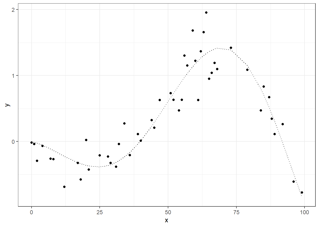
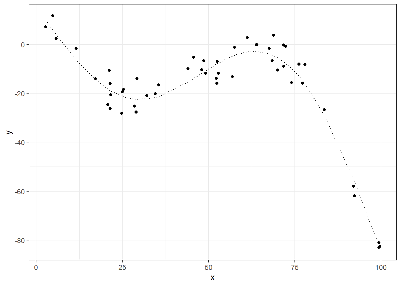
ggplot(dt_tr, aes(x=x)) +
geom_point(aes(y=y)) +
geom_line(aes(y=f), linetype="dotted") +
theme_bw()
|
 1
 2
 3
 4
 5
 6
 7
 8
 9
10
11
12
13
14
15
16
17
18
19
20
21
22
|
# degress to fit
degrees <- c(1,2,3,5,10)
# fit the models
models <- map(degrees, fitPoly, data=dt_tr)
# get fitted values
models %>%
map(function(model){model$fitted.values}) %>%
set_names(paste0("f",degrees)) %>%
as_data_frame() %>%
cbind(dt_tr, .) -> dt_tr_fit
# from wide to long
dt_tr_long <- dt_tr_fit %>%
melt(id.vars="x", variable.name="model", value.name = "fitted")
# plot the fitted values
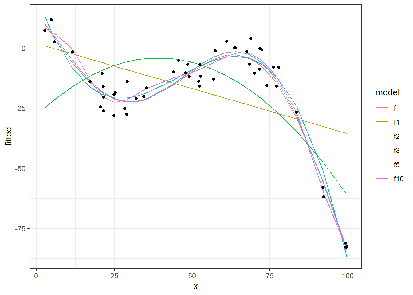
ggplot(dt_tr_long) +
geom_line(data=dt_tr_long[dt_tr_long$model!="y",], aes(x=x, y=fitted, colour=model)) +
geom_point(data=dt_tr_long[dt_tr_long$model=="y",], aes(x=x,y=fitted)) +
theme_bw()
|
 1
 2
 3
 4
 5
 6
 7
 8
 9
10
11
12
13
14
15
16
17
|
# performances
perf <- tibble(
  degree = degrees,
  MSE.tr = unlist(map(models, getMSE)),
  MSE.ts = unlist(map(models, calcMSE, dt_ts))
)

# "the real MSE" inputed by noise
MSE <- sum( (dt$y-dt$f)^2 ) / nrow(dt)

# plot the MSEs
ggplot(perf,aes(x=degree)) +
  geom_line(aes(y=MSE.tr), colour="red") +
  geom_line(aes(y=MSE.ts), colour="blue") +
  geom_hline(yintercept = MSE, linetype="dashed") +
  ylab("MSE") +
  theme_bw()
|
Curve 3
 1
 2
 3
 4
 5
 6
 7
 8
 9
10
11
12
13
14
15
16
17
18
19
20
21
22
23
24
25
|
DOMAIN <- runif(100, 1, 100)

# function linear gausian noise sd=1
f <- function(x) -30*sin( x*(2*pi/length(DOMAIN)) ) - .01*x^2 + 15   #  (sin( (2*pi/length(DOMAIN)) * (x+10) )) * 2*x/100 + 0.001 * x
noise <- function(x) 5*rnorm(x)

tibble(
  x = DOMAIN,
  f = f(x)
) %>%
  # adding noise
  mutate(
    y = f + noise(DOMAIN)
  ) -> dt

# separing in training and testing
idx.tr <- sample(1:length(DOMAIN),round(length(DOMAIN)/2))
dt_tr <- dt[idx.tr,]
dt_ts <- dt[-idx.tr,]

#  visualizing training data
ggplot(dt_tr, aes(x=x)) +
  geom_point(aes(y=y)) +
  geom_line(aes(y=f), linetype="dotted") +
  theme_bw()
|
1
2
3
4
5
6
7
8
9
|
degrees <- c(1,2,3,5,10)

models <- map(degrees, fitPoly, data=dt_tr)

models %>%
  map(function(model){model$fitted.values}) %>%
  set_names(paste0("f",degrees)) %>%
  as_data_frame() %>%
  cbind(dt_tr, .) -> dt_tr_fit
|
1
2
3
|
## Warning: `as_data_frame()` was deprecated in tibble 2.0.0.
## Please use `as_tibble()` instead.
## The signature and semantics have changed, see `?as_tibble`.
|
1
2
3
4
5
6
7
|
dt_tr_long <- dt_tr_fit %>%
  melt(id.vars="x", variable.name="model", value.name = "fitted")

ggplot(dt_tr_long) +
  geom_line(data=dt_tr_long[dt_tr_long$model!="y",], aes(x=x, y=fitted, colour=model)) +
  geom_point(data=dt_tr_long[dt_tr_long$model=="y",], aes(x=x,y=fitted)) +
  theme_bw()
|
 1
 2
 3
 4
 5
 6
 7
 8
 9
10
11
12
13
14
15
|
# performances
perf <- tibble(
  degree = degrees,
  MSE.tr = unlist(map(models, getMSE)),
  MSE.ts = unlist(map(models, calcMSE, dt_ts))
)

MSE <- sum( (dt$y-dt$f)^2 ) / nrow(dt)

ggplot(perf,aes(x=degree)) +
  geom_line(aes(y=MSE.tr), colour="red") +
  geom_line(aes(y=MSE.ts), colour="blue") +
  geom_hline(yintercept = MSE, linetype="dashed") +
  ylab("MSE") +
  theme_bw()
|
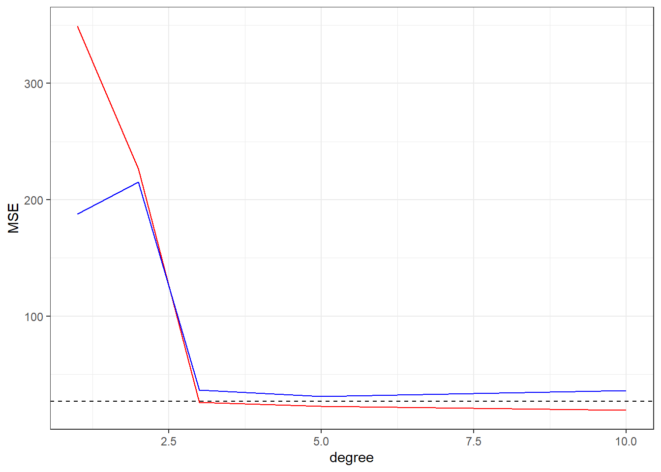
Conclusion
As we see, plotting the cost function (MSE in these cases) of fitted models against Training and Test data is helpful to check the sanity of your model to avoid the over fitting effect.
In these examples we study how the MSE vs Model Flexibility (degrees in the polynomial fitting) but we can study the cost function vs number of features, number of samples and others aspects of you problem domain, this is a know technique to check for over fitting in machine learning projects.
